Toca Social
A game-changing booking experience
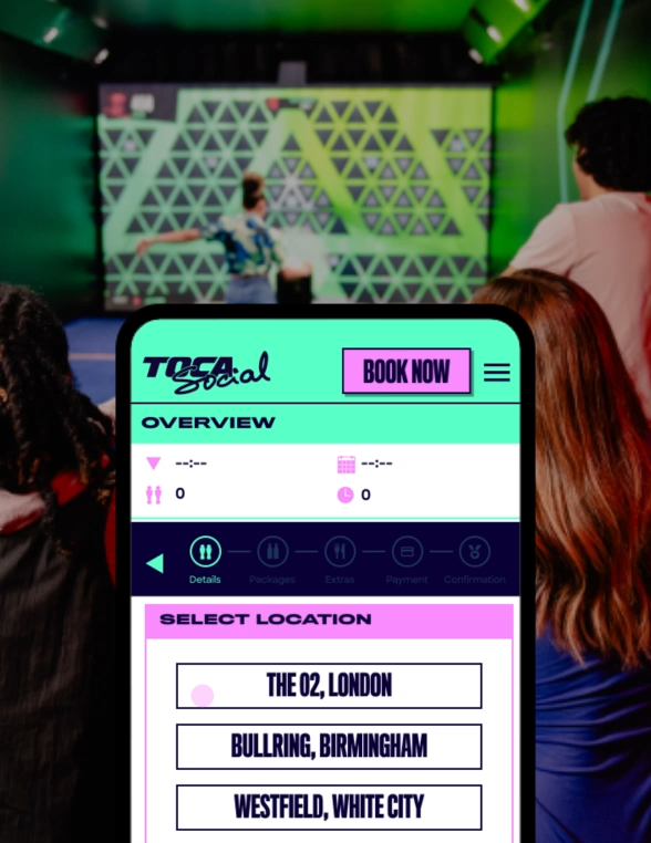
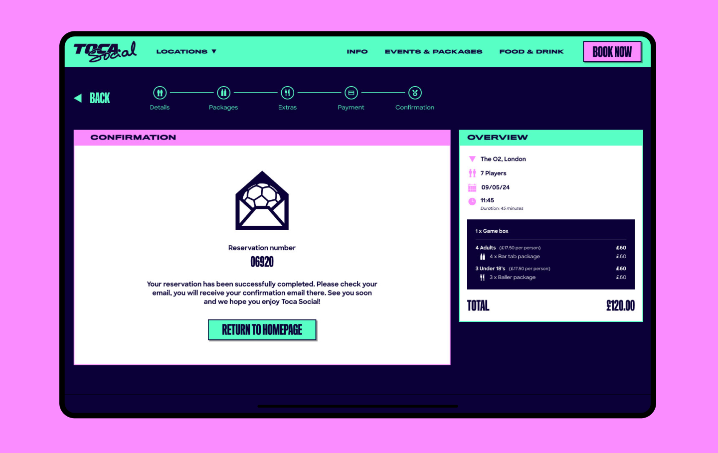
After a full-on Conversion Rate Optimisation (CRO) overhaul, we completely reimagined the booking journey to make it smoother, quicker, and more enjoyable for users. Our mission was simple: cut the hassle, keep the essentials, and make the whole process feel effortless. In just a few clicks, users can book their session and add on extras like food or event packages, no sweat.
Credits
Executive Creative Director - Jacob Beckett
UX/UI Design - Marta Parreno
After a full-on Conversion Rate Optimisation (CRO) overhaul, we completely reimagined the booking journey to make it smoother, quicker, and more enjoyable for users. Our mission was simple: cut the hassle, keep the essentials, and make the whole process feel effortless. In just a few clicks, users can book their session and add on extras like food or event packages, no sweat.
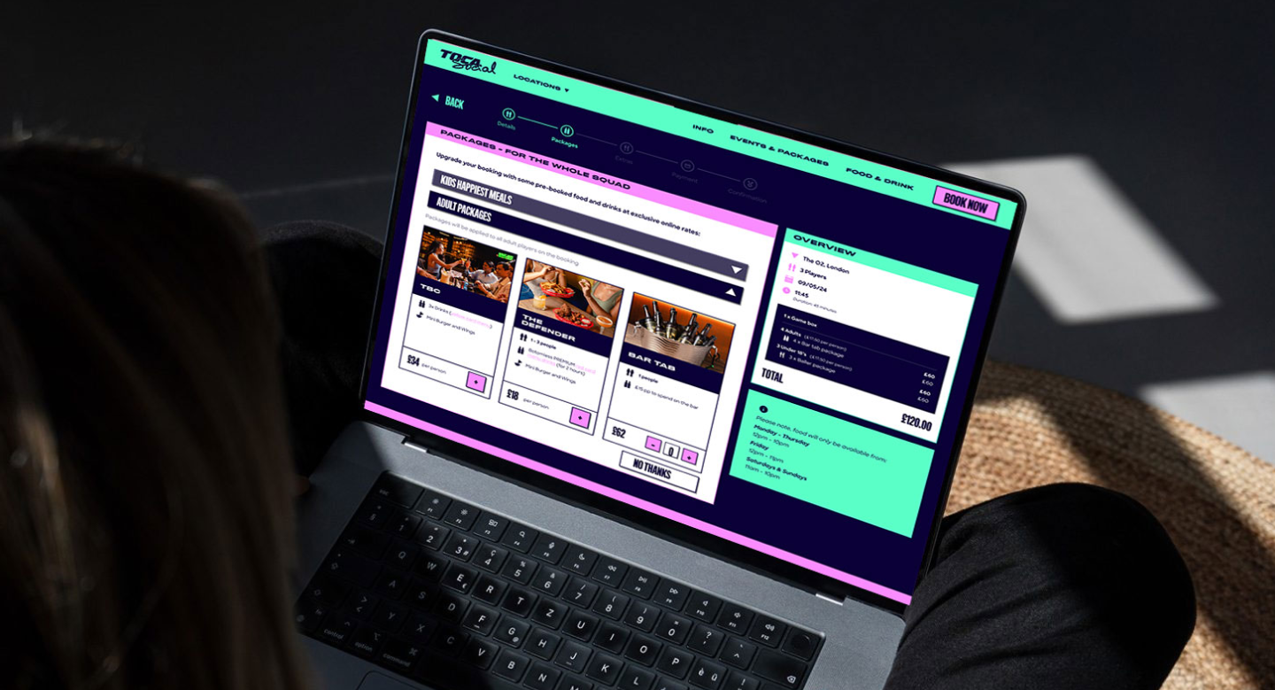

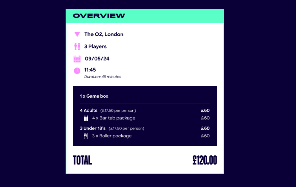
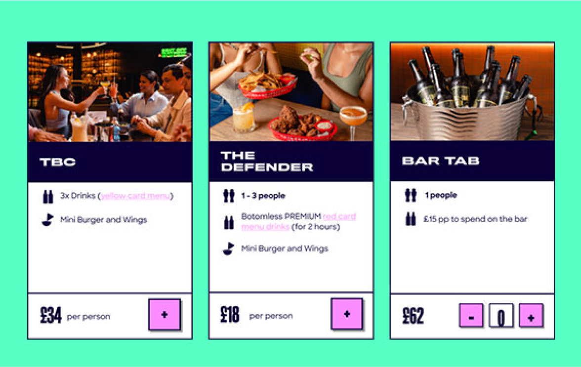
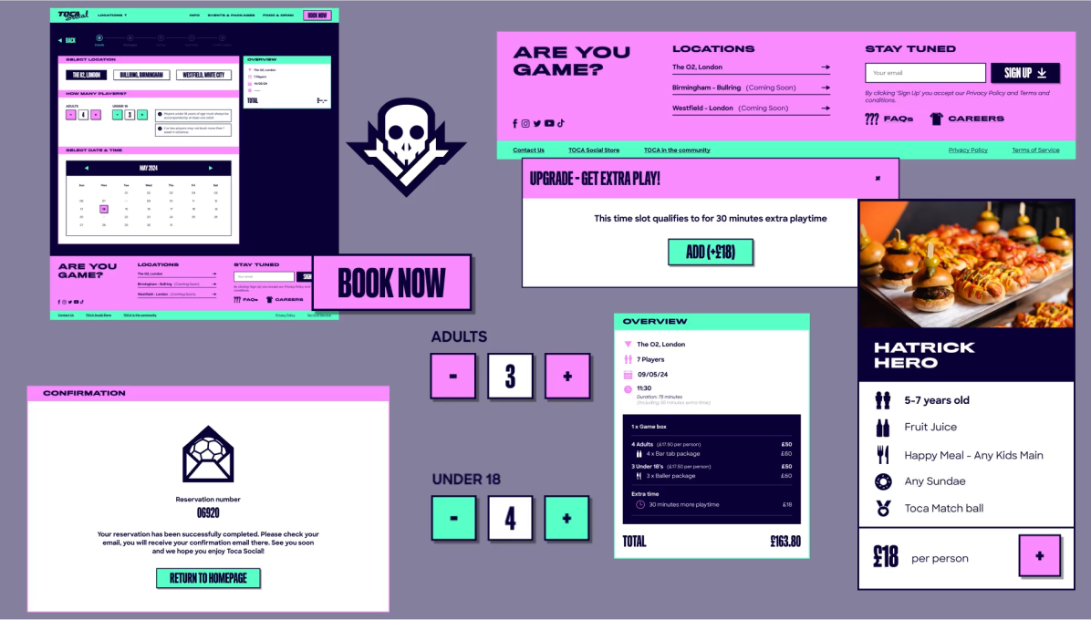
We designed a clean, intuitive interface that makes navigation a breeze. No clutter, no confusion—just a clear, easy path to getting what users want. Whether it’s booking a session or personalising their experience with extras, the process is now as smooth as it gets. A key feature? The ability to customise bookings with upfront pricing and clear scheduling. This not only builds trust but also helps users feel in control, reducing any second-guessing. Less uncertainty means fewer drop-offs and a faster, more confident decision-making process.
The outcome
Results that speak for themselves

Within the first month of launching the new system, conversions shot up by 20%. More bookings, fewer headaches for users, and a noticeable boost in customer satisfaction. It’s been a win all around.
